Description
Embeddable React component that allows users to connect and manage their connected integrations. The Connections React component is an inline version of the hotglue widget. Rather than including the widget as a modal (dialog) in your web-app, the Connections component allows for a more native experience. See an example below:
Connections component preview
Usage
First you must include theHotglueConfig
provider as a higher order component in your React app. For example, in index.js
:
index.js
Connections
component, as shown below:
App.js
Properties
Name | Type | Required | Description |
---|---|---|---|
tenant | string | true | ID of current user of your application. |
filterFlow | function(flowId) => boolean | false | Function to filter flows. By default renders all flows. false to hide, true to show. |
filterEntity | function(flowId, entityId, isTarget) => boolean | false | Function to filter entities within flows (sources and targets). By default renders all entities. false to hide, true to show. |
hideFlows | boolean | false | If true, will hide the flow container and only render the integrations. |
hideBackButtons | boolean | false | If true, will hide the back buttons on the connection page. |
multipleSources | boolean | false | If true, will allow tenants to link multiple sources to the same flow. |
localization | object | false | A localization object |
Styling
The Connections component has defined CSS classes that can be used to override the component’s styling to more closely match your own UI/UX.Flow Container
Each flow is rendered as a section within the Connections component. The classes are shown in the graphic below:
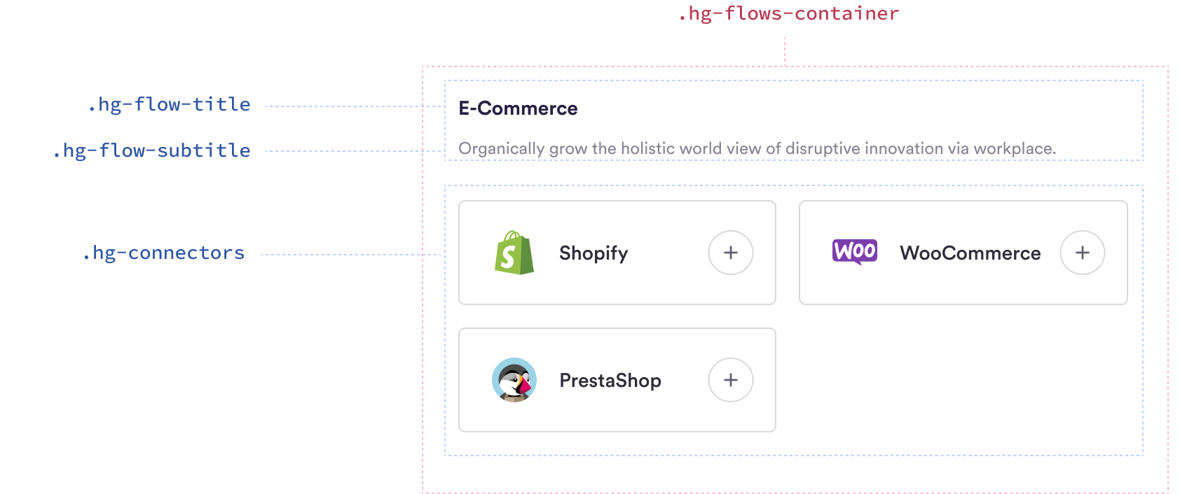
hotglue - Connections Flow Container classes
Class Name | Description |
---|---|
hg-flows-container | Container of the entire flow section |
hg-flow-title | Title of the flow |
hg-flow-subtitle | Subtitle of the flow (description) |
hg-connectors | Container for the connectors section of the flow |
Connector Card Each connector (both sources and targets) are rendered as a card within the Flow Container. The classes are shown in the graphic below:

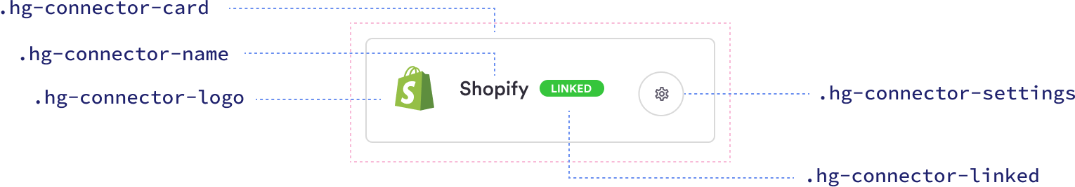
hotglue - Connections Connector Card classes
Class Name | Description |
---|---|
hg-connector-card | Card containing the connector |
hg-connector-card-linked | Connector card for a linked integration |
hg-connector-name | Connector name |
hg-connector-logo | Connector logo |
hg-connector-settings | Connector settings gear |
hg-connector-linked | Connector linked label |
Example Included below is a stylesheet to give the
Connections
component a dark theme.
CSS

Sample styling of Connections component